Evaluate & interpret survey results
The evaluation of your survey is one of the most important steps.
In the following, we will show you different methods and tricks for analyzing and interpreting your results.

You have probably already looked at your results while the survey was running.
At the latest when the survey is completed, you will ask yourself how you can evaluate and interpret the results.
The following instructions will show you how to proceed and evaluate the results.
Let’s get started – let’s go!
Why analyze results
Analyzing the survey results is an essential part of your survey. You conducted the survey to obtain valid data.
It is important to analyze the data correctly so that you draw the right conclusions from the data and do not make any premature assumptions.
The aim of the analysis is to interpret the results. This involves determining the significance of the results and which measures or hypotheses can be derived from them.
Is interpretation too time-consuming for you? Then our AI analyses offer you a fully automated interpretation of your results, including appropriate recommendations for action. This saves you an enormous amount of time and gives you the important insights from your results immediately.
The evaluation and analysis of your survey is divided into several steps.
First, however, we would like to familiarize you with the classic methods of analysis.
The selection of question types has an influence on the analysis
Depending on which question types you have used in your survey, this has an impact on the type of analysis. A basic distinction is made between quantitative and qualitative data.
Quantitative data is nothing more than numbers in various formats. For example, absolute or relative values (%), average values (ø) or a standard deviation.
You obtain these figures from “click questions”, i.e. closed questions such as an NPS scale, a star rating or a rating matrix.

The good thing about numerical values is that they can be directly compared with each other and are perfect for statistical analysis.
Qualitative data, on the other hand, is data that does not contain numbers. This includes free text responses that reflect the opinions of the participants.
Analyzing qualitative data manually is very time-consuming – but it is worth it, because this is the “gold” of a survey.
You find out the personal opinion of each individual and gain deeper insights.
How to analyze the results of your survey
In the following, we will show you step by step how to evaluate, analyze and finally interpret the results of your survey.
- 01 Preparation: Clean up the data
- 02 Creating segments
- 03 Quantitative and qualitative evaluation
- 04 Filtering & comparing
- 05 Cross tables
- 06 Response rate – representative statements
- 07 Interpretation of the results
- 08 Sharing findings
And finally, we would like to introduce you to other methods of analysis:
01 Preparation: Clean up data
Before you start analyzing your results, you should clean up the results. Cleaning up the results is about removing participants that distort your results.
To recognize fake or irrelevant participants, proceed according to the following criteria:
Unrealistic response times
First, see how long the average response time was for all participants, or you can estimate the time based on the number of questions.
If we assume 10 questions, the response time will be between 5-15 minutes – depending on whether free text answers were included or not.
And whether the questions were short and simple or complex. Let’s now assume that the average person took around 10 minutes to answer.
There will be people who can read and answer more quickly. For them, the response time can also be just 5 minutes or, conversely, a little longer. This means that all participants taking less than 5 minutes would be suspected of being a fake participant.
To delete these fake participants from the results, export the results to XLS and sort the column with the response time (shortest time at the top).
Now you have all participants at a glance with a very short response time. Make a note of the participant ID and open the individual results in easyfeedback.
Now search for the participant ID of the participant in question and delete it from the results.
Sporadic response behavior
All those who only do the survey so-so have no serious interest in good feedback and answer a question here and there.
So if several questions have not been answered by a participant, the remaining results will probably not help you.
If you find these participants, delete them from the results as well.
Wrong target group
If you have conducted a survey on car use and asked a segmentation question at the beginning “Do you own a car?”, then all those who answered “No” do not belong to your target group.
In easyfeedback, you do not have to delete these participants.
You can create a filter that only shows the results of people who answered “Yes”.
This way, they will not distort your results and you can view the overall statistics again at any time.
Unrealistic answers
Another way to clean up the results is to remove participants who have given unrealistic answers.
Z. For example, the number of pets should be named and you have provided a dropdown with “1-10”.
All those who have now selected 10 are already very conspicuous and rather unrealistic.
You should remove these participants so as not to distort the results.
Either delete them or create a filter that no longer takes these participants into account.
Consistent answers
For example, if you have placed matrix questions in the questionnaire and a participant always marks “very satisfied”, always “dissatisfied” or always “average”, then you should sort these participants out, as they do not provide you with any added value.
To do this, take your XLS file again and search for the answer options for your matrix. You will then see very quickly whether there are participants who have always given the same answer.
Again, note the participant ID in the first column and delete it from the individual results of your survey.
Unnecessary or incorrect answers
If a participant has entered at the beginning that they own a car, but answers “0 days” to the question “How often do you use your car per month?”, then this does not match and this participant should be deleted.
Now that you have cleaned up your results, create segments:
02 Form segments
As soon as your survey is completed, you will receive the overall results.
At first glance, these give you a good impression of the response to your survey.
However, this only looks at the overall result.
But if you want to analyze your results properly, you need to dive deeper. Don’t worry – it’s not difficult.
Example:
It’s good to know that 80% of your customers are satisfied with your product. But this total does not show you how your individual customer groups see it.
So the question is rather: “How satisfied are my new customers? How satisfied are my existing customers? And how satisfied is my top-selling customer group?”
So you need different angles (perspectives) to look at the results of your survey. And you create filters for this.
When designing the questionnaire, you will certainly have thought about the groups (segments) of your participants.
Groups can be defined, for example, according to age group (18-25, 26-36, etc.), according to the gender of the department in the company or according to customer groups. And you now create a filter for each group that is relevant to you.
We will use the filters later on when looking at the individual perspectives and for comparisons.
03 Quantitative and qualitative evaluation
Quantitative evaluation (descriptive statistics)
As mentioned at the beginning, quantitative analysis is purely an evaluation of the figures.
It is also known as descriptive statistics.
What does descriptive statistics mean?
In descriptive statistics, statistical methods are used to describe the data in order to make a statement about the data.
They are presented in the form of tables and diagrams.
However, no statement (interpretation) can be made about the data set itself.
Classic parameters are
> Frequency distribution (absolute and percentage)
The frequency distribution is often the first step.
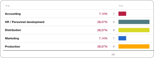
Here you look at the absolute and percentage distribution:
- Absolute frequency is the total number of participants who selected an answer
- Percentage frequency is the percentage of participants who selected an answer.
> Average value
The mean value – called the arithmetic mean or average – adds up all the values and is divided by the total number of answers.
Example:
For the question “How many stars do you rate us with?”

The calculation is as follows: 4*1 + 3*2 + 8*3 + 2*4 + 7*5 /24 = ø 3,21
The average value is: 3.21
> Mode
The mode is the value that was selected the most.
In the previous example, 3 is the mode, as this is the mode in which the most people have given a rating.
> Median
The median is exactly the value that lies in the middle of all assessments. For this purpose, all values are sorted according to size. The median value is then the value that lies directly in the middle:
Simplified example (odd number): 1, 1, 2, 3, 3, 4, 4, 5, 5
In this example, the meridian is “3”, as this is the value in the middle.
If the number of values is even, the two values in the middle are added together and divided by two:
Simplified example (even number): 1, 1, 2, 3, 4, 4, 5, 5
In this example, the meridian is “3.5” (3+4/2).
> Standard deviation
The standard deviation shows the spread of the answers in relation to the mean value.
If the mean value shows the exact numerical center, the standard deviation shows where the mass of answers is located and thus provides information about the range in which most respondents gave an answer.
Example: In our example above, the average value is 3.21. The standard deviation in this example would be 2.58.
Qualitative evaluation
Qualitative evaluation describes the analysis of freely given opinions and statements.
Say all the answers you received to a free text question. For example, “You can give us feedback, suggestions and criticism here:” These answers are free.
You can use quantitative data perfectly to create comparisons or recognize trends. However, you do not know the reasons behind the opinion. It is therefore important to place open text questions in order to assess the results qualitatively.
It is said that “The gold of a survey lies in open text questions. Because in the text answers lie the answers to the questions we did not ask.” We therefore recommend that you always place one or more text questions.
You will get more useful input from text questions than from scale questions or closed questions.
Manual analysis is very time-consuming. With easyfeedback’s AI analysis, your results are automatically evaluated and assessed.
In the qualitative analysis of free text responses, there are several methods that you can combine:
> Sentiment evaluation
For the sentiment evaluation, you look at each individual answer and categorize it as “positive, neutral or negative”.
The best way to do this is to copy all the test answers into an Excel file and write the sentiment rating in the column next to it.
> Topic rating
Next, or directly next to the sentiment evaluation, make a note of the subject area that was discussed in the free text response.
Example from a customer survey: “Many thanks for the great support. We are very satisfied and would recommend you to others.”
The topics would then be: Support; very satisfied, recommendation.
> Subject areas
The next step is to cluster the individual topics into generic topics.
For example: customer support; price; response time; etc.
Each individual piece of feedback is then assigned to a generic topic in addition to the individual topics.
This allows you to see at a higher level how much feedback has been received on a topic.
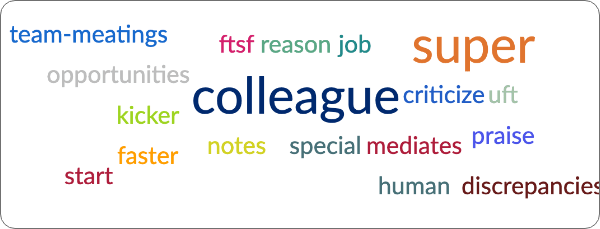
Once you have categorized all the free text responses, you can use the filter functions in Excel to view, for example, only the positive responses or only the responses from one area or in combination.
Word clouds, for example, are very suitable for display, as they allow you to easily recognize the keywords of the subject areas.
04 Filter & Compare
Now that you have created filters for your groups, you can delve deeper into the results:
> Filter results
First, filter your results according to the groups you have created.
This allows you to change the perspective on the respective group of participants and see how they responded during the course of the results.
Simply activate a filter and take a look at the results.
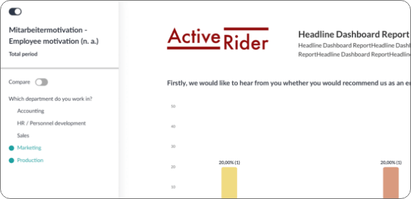
When looking at the results, you will quickly wish for more possible combinations. Let’s take the following example:
You have conducted an employee survey on motivation reasons.
First, you used the eNPS to survey satisfaction.
Now you have created a filter that only shows the dissatisfied employees.
In the further course, you can see that the dissatisfaction results from the cooperation with the supervisor.
Now you know the reasons for the dissatisfaction, but not from which department.
So you need an additive filter to find out the department.
To do this, add the “Department” criterion to your filter.
You can now see what the satisfaction levels are like in the individual departments.
> Compare results
The filters have now given you a deeper insight into the feedback from the individual participant groups.
Next, compare the results.
The comparison allows you to contrast groups and make differences directly visible.
This allows you to see in a diagram how group A) responded in relation to group B).
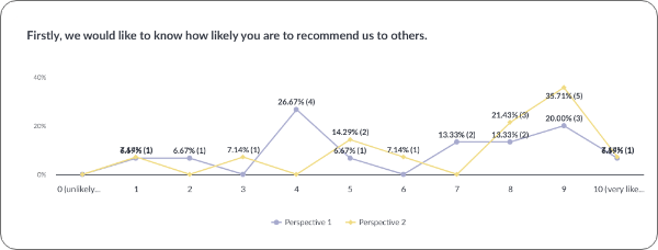
A good example is to compare the satisfaction of employees or customers.
To do this, you can use the results from the NPS query (you can find everything about NPS and the NPS calculation here).
You create a filter for all promoters and one for all detractors.
If you now compare these two groups, you can see where anomalies appear.
This is because, in principle, the detractors (opponents) should have tended to speak against each other everywhere.
If a value now falls off the grid somewhere, then this is an important indication for you that you should follow up.
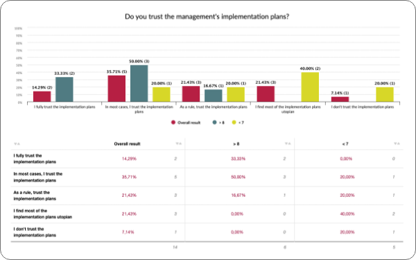
Once you have categorized all the free text responses, you can use the filter functions in Excel to view, for example, only the positive responses or only the responses from one area or in combination.
Word clouds, for example, are very suitable for display, as they allow you to easily recognize the keywords of the subject areas.
05 Cross table
Cross-tabulation analysis is an excellent method for comparing the results of two questions. Sounds difficult – but it’s not.
Let’s take the following example: You have asked your customers how long they have been a customer with you and in a second question you have determined customer satisfaction using the NPS.

Now the answer options from both questions are listed horizontally and vertically in a table and the individual values are entered in the intersecting fields.
Hence the cross table.
This display allows you to see and compare the satisfaction of your customers at a glance according to the customer life cycle (Customer Life Time).

If you don’t want to go to the trouble, you can create several filters in easyfeedback.
For example, you can create individual filters that divide the participants into groups according to the years of the Customer Life Time.
So a filter for “1 year”, a filter for “2-5 years” etc.
If you then switch to comparison mode, you can select the individual years. This allows you to see how the satisfaction of individual customers differs by year.

06 Response rate - representative statements
An important point when interpreting the results is whether the results are representative of the respective survey group. This means whether the results can be equated with the opinion of the entire group.
Example: You are conducting an employee survey and want to be sure at the end that the answers (not all employees will take part) reflect the opinions of all employees. If you want to achieve a margin of error of 0 %, then you need a 100 % participation rate. However, as this is not realistic in most cases, you have to interpret the results with a margin of error.
To calculate the margin of error, you first take the population size. This is the total number of people whose opinion is represented – let’s say 100 employees.
Next, you define the confidence level. This indicates how likely it is that the participating employees will give real feedback.
And finally, you take the actual number of employees who took part. This then gives you the margin of error.
> Here you can easily calculate the margin of error.
If we now assume a margin of error (probability of error) of 5%, then apply this as follows:
When asked “How satisfied are you with the canteen offer?”, 40 % answered “very satisfied”. The result is now output with 5 % + and – and reads “35 – 45 % are very satisfied with the canteen offer.”
To improve the accuracy of the results, a small margin of error is advantageous.
Using the sample size calculator, you can easily work out how many participants influence the margin of error in relation to your population size.
07 Interpretation of the results
What do all the statistics and answers mean for your survey? You have now seen how the results turned out for each question and have probably already carried out a statistical analysis.
You have also taken the trouble to analyze the qualitative results. The next step is to combine and interpret the data.
To do this, you take a topic from the survey that is important to you.
For example, “internal communication”. Now look at all the questions that are related to this topic.
If the main question on the topic shows that 60% are satisfied with internal communication, look at the related questions to see how the employees responded.
If the answers to the main question and the secondary questions were positive, but there are 1-2 rather negative comments in the free text answers, then the interpretation of the results is as follows:
“The attitude towards internal communication was assessed positively across the board by employees. 60% of respondents are very satisfied with communication. Nevertheless, there is criticism that the flow of information on important strategic decisions is very slow and is not always communicated openly.”
In this way, you now go through the results topic by topic and interpret the results.
It makes sense to write an interpretation for each topic and an overall interpretation at the end.
If this is too much effort for you, easyfeedback can take over the complete interpretation of the results with the AI analysis.
Recommendations for action
In order to implement measures now, after the interpretation, you only have to derive suitable measures from the interpretations.
If we stay with our example of internal communication, I would now recommend that you derive 3 measures to improve internal communication step by step.
You can sit down together as a team and think about measures, or you can use the AI analysis from easyfeedback. The AI analysis automatically provides you with recommendations for action.
As soon as you have determined your measures, divide them into 3 categories: shortest, medium and longest implementation time. This allows you to implement the first measure immediately and achieve a quick impact.
Bonus: By implementing the first measure quickly, your employees will have positive feedback from their feedback and will also give you their attention with good feedback in the next survey.
08 Share results
To share the results at the end and present them internally, you have several options.
Firstly, you can create a presentation in PowerPoint and present it or send it as a file. Alternatively, you can also share the results and interpretations as a digital dashboard so that everyone has the opportunity to view them.
With easyfeedback, you have the option of sharing interactive dashboards and preparing them for the individual recipient groups.
When setting up your presentation – whether as a file or an interactive dashboard – we can recommend two concepts:
-
From big to small:
At the beginning of your presentation, you present the most important and meaningful figures or KPIs. In der Regel interessiert sich die Geschäftsführung und das Management zunächst für das große Ganze, um einen Überblick über den aktuellen Stand des Unternehmens zu bekommen. Im Anschluss gehst du dann ins Detail und erklärst, wie sich diese Zahlen zusammensetzen. -
Story Structure:
With this technique, you present the results in the form of a story. This means you start with the goal: "Our goal is to increase employee satisfaction by XX% in 2024. To achieve this, we conducted the following survey. First, we asked employees if they could see themselves still working with us in five years. The result is XXX." The aim is to gradually build suspense, step by step, in order to present the final outcome at the end.
With the presentation of the results, you have completed the analysis and can move on to implementing the measures.
Tip:
By conducting a follow-up survey next year or in the next cycle, you can compare the results with those of the current survey. This comparison will show you whether your measures have had a positive effect and if your numbers are improving.
Further Methods of Analysis
> Factor Analysis
Factor analysis is a method used to simplify data. In factor analysis, the data (response options) are assigned new, “simplified” values (categorized).
By categorizing the data, it becomes possible to calculate a single value per category, making them comparable.
The downside of this method is that multiple response options are grouped into a single category, causing the detailed information that led to the evaluation to be lost.
> Regression Analysis
Regression analysis is a statistical method used to model and analyze the relationships between variables.
The main purpose of regression analysis is to determine the strength and nature of the relationship between a dependent variable (also called the target variable) and one or more independent variables (predictors or influencing factors).
There are various types of regression analysis, each suitable for different data types and research questions.
> Correlation Analysis
Correlation analysis is a statistical method used to determine the strength and direction of a linear relationship between two quantitative variables.
It helps to understand whether and how strongly two variables are related.
Since this method relies purely on statistical probability, the relationship identified is mathematically a coincidental correlation rather than a definitive causal link.
> Levels of Measurement
Analyzing data based on levels of measurement is a crucial aspect of statistics and data analysis. Levels of measurement describe how data is categorized and what mathematical operations are meaningful for them.
There are four fundamental levels of measurement, each offering different properties and analytical possibilities:
-
Nominal Scale:
Data at this level is purely categorical, with no specific order or ranking. Examples include gender, colors, or nationalities. -
Ordinal Scale:
Ordinal data has a natural order or ranking, but the intervals between the values are not necessarily equal. Examples include rankings or school grades. -
Interval Scale:
Interval-scaled data has ordered categories with equal intervals between values, but no true zero point. Examples include temperature in Celsius or IQ scores. -
Ratio Scale:
Data at this level has all the properties of interval data, with the addition of an absolute zero point. Examples include weight, height, or age.
Understanding the level of measurement is critical for selecting appropriate statistical methods and analyses. Misinterpreting the level of measurement can lead to inaccurate or meaningless results.
In practice, data transformations are often performed to make the data more suitable for the chosen analysis if needed.
