Analyzing your survey results
Preparing and analyzing your survey results is the most important part of a survey.
Because without a good interpretation, no profitable measures can be taken.
In the following, we will show you how to analyze the results of your survey:

• Structural organization of the analysis
This means that before you start the analysis, you should establish a structure to determine which perspective on the results is relevant for you.
In an employee survey, the perspective per department or location is important, as this allows the feedback to be viewed from the individual areas and is not distorted by other areas.
So think about the perspectives on the results that are important to you.
This could be, for example:
Employee survey:
- Departments/locations
- Areas of responsibility
- Date ranges (for ongoing surveys)
- 1st, 2nd and/or 3rd survey date
- Employee satisfaction (eNPS)
- Age groups/gender
- Length of service
Customer surveys:
- New/existing customers
- Date ranges (for ongoing surveys)
- Customer satisfaction (NPS)
- Product category
- ø Order value
- Touchpoint
• Segment the results
Now that you know from which angle you want to analyze the results, start segmenting the overall result.
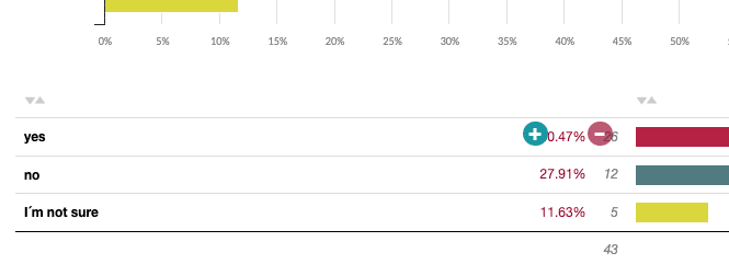
To do this, you can simply click on the percentage values in the data tables in easyfeedback (below the diagrams).

This enables you to activate a filter and only view the segmented target group.
Or you can create fixed filters via the filter menu and activate/deactivate them one after the other.
• Spontaneous segmentation
This part is always very interesting, as you can find angles that you hadn’t thought of before.
The quick filters in the data table are also very helpful for this.
Simply go to a question where you are interested in a segment and click on the respective answer option.
You will then only see the participants who have chosen this answer.
This gives you the opportunity to spontaneously look at the results from different angles.

• The Insight comparison
This is where it gets really exciting.
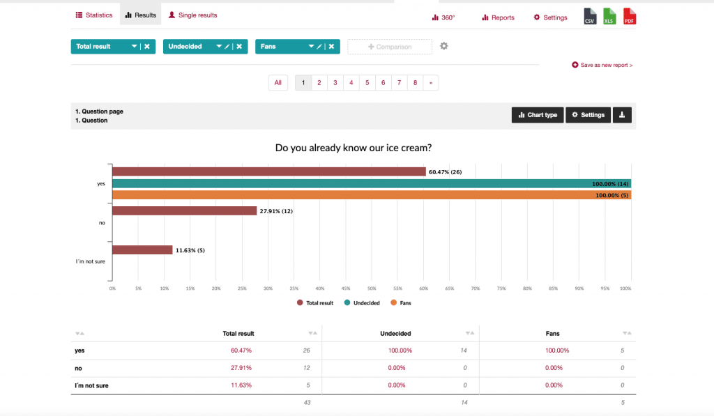
You use comparisons to contrast individual segments (departments, locations, target groups, date ranges, etc.) and identify differences.
This allows you to gain a lot of insights and see the differences in the individual segments.
Use easyfeedback’s comparison filters and position 2, 3 or more next to each other. In the first comparison perspective, leave the overall result as your benchmark.

Next to it, select the filters you have already created (e.g. departments). As soon as you activate the comparison, you will see how the individual perspectives have responded.
• Interpret comparisons
You can use comparisons to make differences visible very quickly and easily.
A very popular comparison is “Satisfied employees/customers vs. dissatisfied employees/customers”.
Here you can see where and in which areas satisfaction differs greatly or coincides. And where satisfaction deviates too much, the greatest impact is on optimization.
Or you can compare two departments “A vs. B”.
In the comparison, you will then see which subject areas are more important to the individual departments or not.
Or where cooperation with the line manager harmonizes better or not. And where it doesn’t harmonize well can be addressed.
Or if you compare two, three or four product groups, you can see the customer satisfaction per product and, if applicable, the average sales prices.
The product with the lowest satisfaction and preferably with a high average selling price should be periodized by you in order to increase customer satisfaction and achieve good sales in the long term.
Of course, there are often other parameters that determine which product is the most valuable for the company – we just want to give you some ideas on how to analyze the results.

• General interpretation
For everything you look at in the results, it is important that you write down an interpretation of it directly.
This means remembering what the result means from different perspectives.
Here is a small example:
You have created a comparison on "Satisfied vs. dissatisfied employees". Now you ask whether the employees support the management's ideas. You can see that the satisfied employees are less supportive of the ideas.
What does that mean for you?
In general, you have satisfied employees who are committed to the company.
However, they have probably been presented with new ideas so often in a short space of time that they simply say to themselves
“Let them do it up there, next week it will look different again.”
Meaning for you: You need to work on how you communicate ideas in order to pick up all employees who then follow you.
Creation of interactive reports for presentation
Now that you have dealt with the analysis and interpretation of the results, you know the important perspectives and where there is potential for improvement.
Now you just need to present the results.
And for this we recommend the Result STUDIO from easyfeedback.
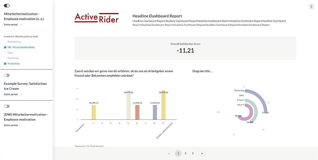
The STUDIO result allows you to create individual reports from all your surveys and perspectives, which can then be shared interactively.
Create a report that contains all the data. Within the report, you then create filters that the recipient can use. The recipient can then analyze the results independently.
Thanks to the flexible options in Result STUDIO, you don’t have to include every question in the report.
Some questions may be superfluous and you can simply deselect them.
This reduces the view to the essentials and the recipient only sees the data that is relevant.
Alternatively, you can also create a link to your views from within easyfeedback, but the options here are somewhat more limited.
Just give it a try.
And if you would like us to provide you with comprehensive support for your goals, just get in touch.
With easyfeedback’s “Performance Consulting”, we integrate the feedback loop into your company and tackle your goals together.


