Pie chart
A pie chart is a graphical representation that shows the proportions of a whole in a circle.
The circle represents 100%, and each “pie slice” area represents a specific proportion or category.
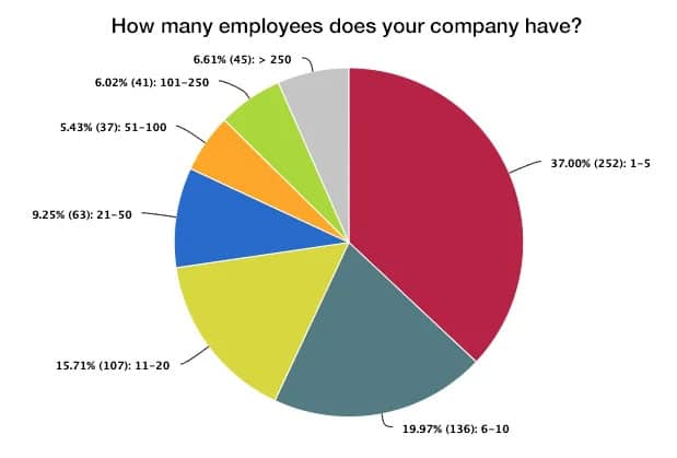
- Advantage: Easy to understand, clear representation of proportions
- Disadvantage: Confusing when there are more than 4–5 categories
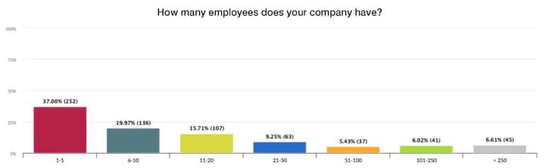
Bar chart
A bar chart is a graphical representation in which data values are illustrated by horizontal or vertical bars.
The length of the bars represents the respective value of a category.
- Advantage: Comparison of categories, even with many values.
- Disadvantage: Small differences are difficult to see.
Column chart
A column chart is the vertical version of a bar chart: instead of horizontal bars, vertical columns are used to represent data.
The height of each column corresponds to the respective value of a category.
- Advantage: Clear structure, suitable for time comparisons
- Disadvantage: Limited overview with many groups
Scatter plot
A scatter plot displays data as individual points in a coordinate system.
Each point represents a pair of values from two variables – e.g., income and age or height and weight.
- Advantage: Ideal for correlation analyses
- Disadvantage: Statistical knowledge required
Histogram
A histogram is a special bar chart used to represent the frequency distribution of metric (numerical) data.
The values are divided into intervals (classes), and the frequency (number of values) is represented as a bar for each interval.
- Advantage: Clear analysis of distributions
- Disadvantage: Not suitable for categorical data
Stacked bar or column chart
A stacked bar or column chart is an extension of the classic bar or column chart.
Several data series are displayed on top of each other (stacked) in a single bar or column.
Each “layer” in the stack represents a partial value—together they add up to the total value.
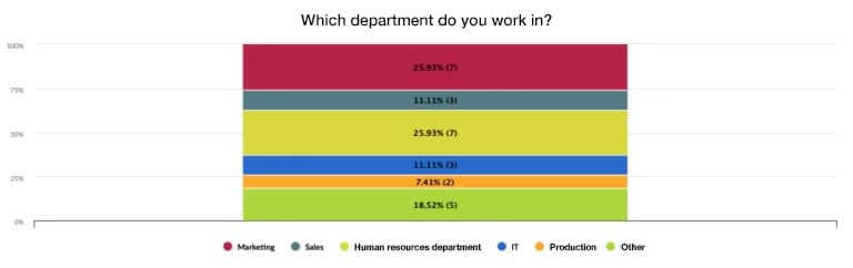
- Advantage: Display of compositions
- Disadvantage: Quickly becomes confusing with many segments
Area chart
An area chart is a variant of the line chart in which the area under the line is filled in.
This not only shows the trends in the data, but also emphasizes the proportions over time or across categories.
- Advantage: Shows overall development and its composition
- Disadvantage: Overlapping can be confusing
Box plot (box-and-whisker plot)
A box plot (also known as a box-and-whisker plot) is a statistical graph used to represent the distribution of metric data. It shows at a glance:
- Central tendency (median),
- Dispersion (quartiles),
- and Outliers.
The representation consists of a box and two “whiskers” (line arms) that summarize the data distribution.
- Advantage: Statistically meaningful, shows dispersion
- Disadvantage: Requires explanation for laypeople
Radar or web chart
A radar or web chart (also known as a spider chart) is a graphical representation in which several variables are displayed on axes that radiate from a common center point.
The values are plotted along these axes and then connected to each other, creating a multi-sided area in the web.
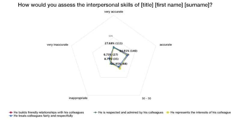
- Advantage: Comparison of several features at a glance
- Disadvantage: Confusing when there are many axes
Word cloud
A word cloud is a graphical representation of words in which the frequency of a term is visualized by its font size: the more often a word is mentioned, the larger it appears.
- Advantages: Makes it easier to recognize patterns in free-text responses.
- Disadvantages: More qualitative than quantitative—no exact values can be identified.
Likert diagram
A Likert diagram shows the results of scale questions in surveys where participants indicate their agreement or disagreement with statements – usually on a 5- or 7-point scale (e.g., from “strongly disagree” to “strongly agree”).
- Advantage: Shows the distribution of opinions at a glance
- Disadvantage: The intervals between the scale points are often assumed to be equal, although they are not necessarily so.
Conclusion
The selection of the appropriate chart type depends on the type of data and the purpose of the visualization. While bar, column, and pie charts are commonly used for closed questions, line charts provide insights into developments over time.
Likert charts are ideal for opinion polls, and word clouds add a creative, visual dimension to open-ended questions.
A cleverly chosen chart not only makes complex data understandable—it also tells a compelling story.
More tips & tricks for surveys
- How long should a survey be open for responses?
- Survey or questionnaire? Find out the decisive difference!
- Evaluating surveys with easyfeedback: Effectively collect and analyze feedback
- Tips for increasing participation rates in employee and customer surveys
- 8 tips for building your questionnaire
- Tips & tricks to motivate more participants to take part in the survey
- Why you shouldn’t ask as many questions as you like in your survey
- Negative feedback after a survey: how to best deal with it!
- 7 proven practical tips for creating your next questionnaire
- Formulating texts and questions when creating your questionnaire