
Analysing survey results & identifying trends
Analysing your survey is one of the most important steps. Below, we’ll show you the various methods and tips for analysing the results of your questionnaire, identifying key findings and, finally, interpreting them.
- Why analyse results?
- The impact of the question type on the analysis
- Analysing a questionnaire – explained step by step
- 01 Preparation: Cleaning up the data
- 02 Create segments
- 03 Quantitative and qualitative analysis
- 04 Filter & Compare
- 05 Cross-tabulations
- 06 Response rate – representative findings
- 07 Interpretation of the results
- 08 Sharing insights
- Further methods of analysis
Evaluate the questionnaire in terms of statistics and content
Analysing a survey does not merely reveal how participants responded. Above all, it reveals the insights hidden within the results.
Whether it’s employee feedback, a customer survey, a seminar survey or a questionnaire: it is only through analysis that it becomes clear where trends are emerging, which issues require attention and where there is a specific need for action.
In this guide, we show you how to analyse survey results both statistically and in terms of content, interpret the signals correctly and derive specific measures from them.
Why analyse results?
Analysing the survey results is an essential part of your survey. You carried out the survey to obtain valid data.
However, data alone does not provide any insights.
It is only through analysis that the signals hidden within the responses become apparent. These signals show you where satisfaction lies, where problems arise, which issues are mentioned repeatedly, and which trends you should examine more closely.
The aim of the analysis is therefore not merely to calculate figures or summarise responses. The aim is to understand the significance of the results and to derive concrete actions or hypotheses from them.

Do you find interpreting the results too time-consuming? If so, our AI analyses offer you a fully automated interpretation of the results, including appropriate recommendations for action. This saves you a huge amount of time and provides you with key insights from the results straight away.
The evaluation and analysis of your survey is divided into several steps.
First, however, we would like to familiarise you with the traditional methods of analysis.
The choice of question types influences the analysis
Depending on the question types you have used in your survey to structure the questionnaire, this will affect the type of analysis. A basic distinction is made between quantitative and qualitative data.
Quantitative data is simply numbers in various formats. For example, absolute or relative values (%), averages (ø) or a standard deviation.
You obtain these figures from ‘click questions’, i.e. closed questions such as an NPS scale, a star rating or an evaluation matrix.
Do you find interpreting the results too time-consuming? If so, our AI analyses offer you a fully automated interpretation of the results, including appropriate recommendations for action. This saves you a huge amount of time and provides you with key insights from the results straight away.
The good thing about numerical values is that they can be directly compared with one another and are ideal for statistical analysis.
Numerical values often provide the first measurable indicators. For example, they show you whether satisfaction is rising or falling, whether certain groups rate things differently, or whether particular issues are perceived as particularly critical.
However, it is important to note that a numerical value does not in itself constitute an interpretation. An average of 3.2 initially tells you only how things were rated. The real question is: why were they rated that way, and what signal lies behind it?
Qualitative data, on the other hand, is data that does not contain numbers. This includes open-ended text responses that reflect the participants’ opinions.
Analysing qualitative data manually is very time-consuming – but it is worth the effort, as this is where the ‘gold’ of a survey lies.
You learn the personal opinion of each individual and gain deeper insights.
Analysing a questionnaire – explained step by step
Below, we will guide you step by step through how to evaluate, analyse and, finally, interpret the results of your survey.
And finally, we would like to introduce you to some further methods of analysis:
01 Preparation: Cleaning up the data
Before you begin analysing your results, you should clean them up. Cleaning up the results involves removing participants who skew your findings.
To identify fake or irrelevant participants, use the following criteria:
Unrealistic response times
First, check what the average response time was across all participants, or you can estimate the time based on the number of questions in the questionnaire.
If we assume there are 10 questions, the response time will be between 5 and 15 minutes – depending on whether or not there were open-ended questions.
And whether the questions were short and simple or complex. Let’s now assume that, on average, it took around 10 minutes to complete the questionnaire.
There will be people who can read and answer more quickly. For them, the completion time might be as little as 5 minutes, or conversely, slightly longer. Consequently, any participant who took less than 5 minutes would be suspected of being a fake participant.
To remove these fake participants from the results, set up a time filter in easyfeedback. Here, you can define, for example, ‘all participants with a response time of less than 30 or 60 seconds’.
You now have all participants with a very short response time at a glance. You can either remove these participants from the results or reverse the results filter by displaying all participants with a response time “over 60 seconds”. This will exclude the fake participants.
You can also analyse the survey results using Excel. Simply sort the participants by “response time” from shortest to longest.
Inconsistent response behaviour
Anyone who goes through the survey half-heartedly has no genuine interest in providing useful feedback and only answers the odd question here and there.
So if a participant has left several questions unanswered, the remaining results are very unlikely to be of any use to you.
If you come across such participants, you should also remove them from the results.
Wrong target audience
If you have conducted a survey on car use and asked a segmentation question at the start of the questionnaire – “Do you own a car?” – then anyone who answered “No” does not belong to your target group.
In easyfeedback, you do not need to delete these participants.
You can create a filter that displays only the results of those who answered ‘Yes’.
This ensures that their responses do not skew your results, and you can view the overall statistics at any time.
Unrealistic answers
Another way to refine the results is to remove participants who have given unrealistic answers.
For example, respondents are asked to state the number of pets they have, and you have provided a drop-down menu with options ranging from ‘1–10’.
Anyone who has selected ‘10’ stands out immediately and is likely to be unrealistic.
You should remove these respondents so as not to skew the results.
You can either delete them or create a filter that excludes these respondents.
Consistent answers
For example, if you have included matrix questions in the questionnaire and a respondent consistently ticks ‘very satisfied’, ‘dissatisfied’ or ‘neutral’, you should filter out these respondents, as they do not provide you with any added value.
To do this, open the XLS file again and search within it for the response options relating to the matrix. You will then very quickly see whether there are any respondents who have always given the same answer.
Make a note of the respondent ID in the first column and delete these respondents from the individual survey results.
Unnecessary or incorrect answers
If a respondent indicated at the start that they own a car but answered ‘0 days’ to the question ‘How often do you use your car each month?’, this is a contradiction and that respondent should be removed.
Now that you have cleaned up the results for the questionnaire analysis, create segments:
02 Create segments
As soon as your survey is complete, you will receive the overall results.
These will give you a good overview of the survey response rate at a glance.
However, this only looks at the results at an overall level.
If you want to analyse the results properly, you’ll need to dig a bit deeper. Don’t worry – it’s not difficult.
Example:
It’s good to know that 80 per cent of your customers are satisfied with your product. But this overall figure doesn’t tell you how individual customer groups feel.
So the question is really: “How satisfied are my new customers? How satisfied are my existing customers? And how satisfied is my highest-spending customer group?”
You therefore need different angles (perspectives) from which to examine the survey results. And to do this, you apply filters.
Segments help you pinpoint signals more accurately.
An overall result merely shows you that an issue exists. Segmentation shows you where this issue is particularly prevalent.
Example: If 80% of your customers are satisfied, that sounds positive at first. However, if only 55 per cent of your new customers are satisfied, whilst existing customers give very positive ratings, a clear signal emerges: the onboarding of new customers should be analysed in greater detail.
Without segmentation, this signal remains hidden within the overall result.
When designing the questionnaire, you will certainly have given some thought to the groups (segments) of participants.
Groups can be defined, for example, by age group (18–25, 26–36, etc.), by gender, by department within the company or by customer group. You should now set up a filter for each relevant group.
We will use these filters later on when examining the data from individual perspectives and for making comparisons.
03 Quantitative and qualitative analysis
Quantitative analysis (descriptive statistics)
As mentioned at the beginning, quantitative analysis involves analysing the figures alone.
It is also known as descriptive statistics.
What does ‘descriptive statistics’ mean?
In descriptive statistics, statistical methods are used to describe the data in order to draw conclusions from it.
The data is presented in the form of tables and diagrams.
However, no conclusions (interpretations) can be drawn about the dataset itself.
The quantitative analysis therefore provides you with a measurable basis. It shows how pronounced a signal is.
Example: If 35 per cent of respondents rate an answer negatively, this is a different signal to one where the figure is 5 per cent. Whilst the figure alone does not explain the cause, it does indicate how urgently an issue should be addressed.
That is why quantitative analysis is the first step in identifying and prioritising relevant signals.
Classic parameters include:
Frequency distribution (absolute and percentage)
The frequency distribution is often the first step.
In doing so, you look at the absolute and percentage distributions:
- Absolute frequency is the total number of participants who selected a response
- Percentage frequency is the percentage of participants who selected a particular answer

Mean value
The mean – also known as the arithmetic mean or average – is calculated by adding up all the values and dividing the total by the number of responses.
Example:
For the question ‘How many stars would you give us?’

The calculation is as follows: 4 × 1 + 3 × 2 + 8 × 3 + 2 × 4 + 7 × 5 / 24 = ø 3.21
The average value is: 3.21
Mode
The mode is the value that was chosen most often.
In the previous example, 3 is the mode, as this is the value for which the most people gave a rating.
Media
The median is precisely the value that lies in the middle of all the values. To find it, all the values are sorted in order of magnitude. The median is then the value that lies exactly in the middle:
A simplified example (odd number of values): 1, 1, 2, 3, 3, 4, 4, 5, 5
In this example, the median is ‘3’, as this is the value in the middle.
If the number of values is even, the two values in the middle are added together and divided by two:
Simplified example (even number): 1, 1, 2, 3, 4, 4, 5, 5
In this example, the median is ‘3.5’ (3 + 4/2).
Standard Deviation
The standard deviation indicates the spread of the responses relative to the mean.
While the mean represents the exact numerical center, the standard deviation indicates where the bulk of the responses are concentrated, thereby providing insight into the range within which most respondents gave their answers.
Example: In our example above, the mean is 3.21. The standard deviation in this example would be 2.58.
The standard deviation indicates the spread of the responses relative to the mean.
While the mean represents the exact numerical center, the standard deviation indicates where the bulk of the responses are concentrated, thereby providing insight into the range within which most respondents gave their answers.
Example: In our example above, the mean is 3.21. The standard deviation in this example would be 2.58.
Qualitative analysis
Qualitative analysis refers to the analysis of open-ended opinions and comments.
In other words, all the responses you have received to an open-ended question. For example, “You can provide us with feedback, suggestions and criticism here.” These responses are open-ended.
Quantitative data is ideal for making comparisons or identifying trends. However, you do not know the reasons behind the opinions. It is therefore important to include open-ended questions in order to assess the results qualitatively.
It is said that ‘the gold of a survey lies in open-ended questions. For it is in the text responses that we find the answers to the questions we did not ask.’
Open-ended text questions therefore often provide the strongest insights from a survey.
Whilst scale-based questions show how highly a topic is rated, open-ended text responses often explain why a result turned out the way it did.
Example: A customer survey shows you an average satisfaction score. It is only in the open-ended responses that it becomes clear that many customers are not criticising the product itself, but rather the response time from customer support.
This is precisely why open-ended questions are so valuable. They reveal causes, expectations, frustrations and areas for improvement that often remain hidden in closed-ended questions.
Manual analysis is very time-consuming. With easyfeedback’s AI analysis, your results are automatically interpreted, analysed and presented to you as recommendations for action.
When carrying out a qualitative analysis of open-ended responses, there are several methods that you can combine:
Sentiment assessment
When assessing sentiment, you look at each individual response and categorise it as ‘positive, neutral or negative’.
The best way to do this is to copy all the text responses into an Excel file and enter the sentiment rating in the column next to them.
Tip: As this is very time-consuming, we offer an automatic sentiment analysis tool called easyfeedback.
Topic assessment
Next, or straight after the sentiment assessment, make a note of the topic discussed in the free-text response.
Example from a customer survey: “Thank you very much for the brilliant support. We’re very satisfied and will recommend you to others.”
The topics would then be: support; very satisfied; recommendation.
Tip: We also offer a fully automated topic assessment service. This saves you a lot of time.
Subject areas
Next, group the individual topics into broader categories.
For example: customer support; price; response time; etc.
Each piece of feedback is then assigned not only to the individual topic areas but also to a broader category.
This allows you to see, at a higher level, how much feedback has been received on a particular topic.

Now that you have categorised all the free-text responses, you can use Excel’s filter functions to view, for example, only the positive or only the negative feedback from a particular range, or a combination of both.
Word clouds, amongst other things, are very well suited for visualising the data, as they allow you to clearly identify the keywords associated with each topic area.
04 Filter & Compare
Now that you have created filters for your groups, you can delve deeper into the results:
Filter results
First, filter the results according to the groups you have created.
This allows you to switch the view to the respective participant groups and see how they responded as you scroll through the results.
Simply activate a filter and take a look at the results.

When looking at the results, you will soon find yourself wishing for further combination options. Let’s take the following example:
You have carried out an employee survey on the reasons for motivation.
Firstly, you used the eNPS to gauge satisfaction.
You have now created a filter that shows only the dissatisfied employees.
As you look further, you see that the dissatisfaction stems from working with their line manager.
You now know the reasons for the dissatisfaction, but not which department it comes from.
So you need an additional filter to identify the department.
To do this, you add the ‘Department’ criterion to the filters.
This allows you to see how satisfaction levels break down across the individual departments.
Compare results
Thanks to the filters, you now have a deeper insight into the feedback from the individual participant groups.
Next, compare the results.
By comparing them, you can contrast groups and highlight differences immediately.
Comparisons reveal differences — and differences are often the most important indicators in a survey.
If two groups’ responses are very similar, this suggests a consistent view. However, if groups’ responses differ significantly, you should take a closer look.
Example: Customers with short contract terms rate the service significantly lower than long-standing customers. This result is more than just a difference in the chart. It is a sign that new customers may have different expectations, are not being catered for as well, or need more support during onboarding.
Comparisons therefore help you not only to see the results, but also to understand the underlying trends.

A good example is to compare employee or customer satisfaction, for instance.
To do this, you can use, for example, the results from the NPS survey (you can find everything you need to know about the NPS and how it is calculated here).
You create a filter for all promoters and another for all detractors.
By comparing these two groups, you can identify which issues are particularly strongly linked to satisfaction or dissatisfaction.
Example: Promoters rate product quality, support and value for money very highly. Detractors also rate product quality highly, but rate support significantly lower.
The message is therefore not: ‘Our product is poor.’
The actual message is: ‘Dissatisfaction stems primarily from the support experience.’
It is precisely this distinction that is important to ensure you do not take the wrong course of action.

05 Cross-tabulations
Cross-tabulation is an excellent method for analysing the results of two questions in relation to one another. It sounds complicated – but it isn’t.
Let’s take the following example: you asked your customers how long they have been customers of yours, and in a second question you measured customer satisfaction using the NPS.

You can find out how to use the NPS, what its benefits are and how it is calculated here in the NPS calculator.
The response options from both questions are now listed horizontally and vertically in a table, and the individual values are entered in the intersecting cells.
Hence the term ‘cross-tabulation’.
This presentation allows you to see and compare your customers’ satisfaction levels across the customer lifecycle at a glance.
A cross-tabulation helps you to highlight correlations between two questions.
This allows you not only to see how a group has rated things, but also to identify which factors are linked to specific ratings.
Example: If customers with short contract durations are more frequently dissatisfied than long-standing customers, this may be a sign of problems with onboarding, expectations or the early stages of using your service.
The cross-tabulation therefore does not merely show you differences; it helps you identify possible causes behind these differences.

If you don’t want to go to the trouble, you can set up several filters in easyfeedback.
For example, you can create individual filters, each of which divides participants into groups based on their customer lifetime in years.
So, one filter for ‘1 year’, one filter for ‘2–5 years’, and so on.
When you then switch to comparison mode, you can select individual years. This allows you to see how satisfaction levels vary among individual customers over the years.

06 Response rate – representative findings
An important consideration when interpreting the results is whether they are representative of the survey group in question. This means determining whether the results can be taken as representative of the views of the entire population.
Example: You are conducting an employee survey and want to be sure that the responses (not all employees will take part) reflect the views of all employees. If you want to achieve a margin of error of 0 per cent, you need a 100 per cent response rate. However, as this is not realistic in most cases, you will need to interpret the results taking a margin of error into account.
To calculate the margin of error, first take the population size. This is the total number of people whose views are being represented – let’s say 100 employees.
Next, define the confidence level. This indicates how likely it is that the participating employees are providing genuine feedback.
And finally, take the actual number of employees who took part. This then gives you the margin of error.
You can calculate the margin of error very easily here.
If we now assume a margin of error (probability of error) of 5 per cent, apply it as follows:
When asked “How satisfied are you with the food on offer in the canteen?”, 40% replied “very satisfied”. The result is now displayed with a 5% margin of error (plus or minus) and reads “35–45% are very satisfied with the food on offer in the canteen.”
To improve the accuracy of the results, a small margin of error is beneficial.
Using the sample size calculator, you can easily work out how many participants, relative to the size of your population, affect the margin of error.
07 Interpretation of the results
Now comes the most important part of the analysis: interpretation.
So far, you have seen how the results broke down for each question, which statistical values are relevant, and what differences exist between groups.
The crucial question now is:
What do these results mean?
Interpretation is about linking individual figures, open-ended responses and group comparisons. Only then can you recognise the signals hidden within your survey results.
A signal arises, for example, when:
- a topic is rated negatively particularly frequently
- several open-ended responses mention the same point of criticism
- a particular group of respondents answers very differently
- quantitative and qualitative results point in the same direction
- a result deviates significantly from your expectations
Let’s take the topic of ‘internal communication’ as an example.
The main question reveals that 60 per cent of respondents are satisfied with internal communication.
At first glance, this result appears positive.
However, you should now examine further questions relating to communication. For example:
- Is important information shared in good time?
- Are decisions transparent?
- Do employees feel sufficiently involved?
You should also look at the open-ended responses.
If there are repeated mentions that strategic decisions are communicated too late or are unclear, this sends a more nuanced signal.
The interpretation could then be:
“Internal communication is generally viewed positively. 60 per cent of respondents are satisfied with communication. At the same time, the free-text responses show that strategic decisions, in particular, are not always communicated in a timely or transparent manner. This signal does not point to a fundamental communication problem, but rather to a need for improvement in terms of transparency and the flow of information regarding important company decisions.”
This is precisely how a result is turned into a robust interpretation.
It’s important not to jump to conclusions.
A single low value is not yet a definitive signal. Only when multiple results point in the same direction does a reliable pattern emerge.
That’s why you should always combine three levels when interpreting the data:
- What do the numbers show?
- What do the open-ended responses say?
- What differences are apparent between groups or segments?
If all three levels point to the same theme, you’ve found a strong signal.
If you find manual interpretation too time-consuming, easyfeedback can take care of this step for you using AI analysis.
The AI analysis identifies patterns, summarises relevant results and interprets the key insights from your survey.
It does not merely examine individual responses, but analyses the relationships between ratings, topics and open-ended responses.
Recommendations for action
Once you have interpreted the signals, you can derive appropriate measures from them.
It is important to note that not every signal requires immediate, major action.
Some signals indicate an urgent need for action. Others highlight issues that should be monitored further. Still others point to areas of potential that can be specifically developed.
Sticking with the example of internal communication, suitable measures could include:
- introducing regular updates on strategic decisions
- involving managers more closely in internal communication
- establishing a fixed format for questions and feedback
The measure should always be appropriate to the signal.
To do this, you can get together as a team and come up with measures, or you can use easyfeedback’s AI analysis. The AI analysis automatically provides you with recommendations for action.
If the message is that there is ‘too little transparency’, simply increasing the frequency of communication will not automatically help. What is crucial is that the right information is communicated more clearly, earlier and in a way that is easier to understand.
08 Share results
To share and present the results internally, you have several options.
Firstly, you can create a presentation in PowerPoint and deliver it in person or send it as a file. Alternatively, you can share the results and interpretations as a digital dashboard, so that everyone has the opportunity to view them.
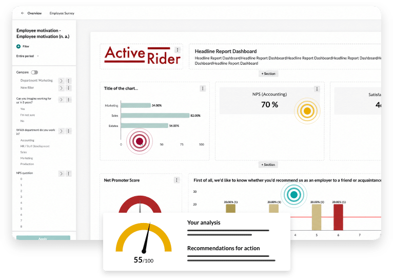
With easyfeedback, you can share interactive dashboards and tailor them for specific recipient groups.
When putting together your presentation – whether as a file or an interactive dashboard – we can recommend two approaches:
-
From largest to smallest:
At the beginning of your presentation, present the most important and meaningful figures or KPIs. As a rule, the board and management are initially interested in the big picture to get an overview of the company’s current status. You then go into detail and explain how these figures are broken down. -
Story structure:
With this technique, you present the results as a story. This means you start with the objective: “The aim is to increase staff satisfaction by XX per cent by 2024. To this end, we carried out the following survey. First, we asked staff whether they could imagine still working for us in five years’ time. The result is XXX.” The aim is to build suspense step by step, so that you can present the final result at the end.
Once you have presented the results, you have completed the analysis and can move on to implementing the measures.
Tip:
By conducting a follow-up survey next year or in the next cycle, you can compare the results with those of the current survey. This comparison will show you whether your measures are having a positive effect and whether your figures are improving.
Further methods of analysis
Factor analysis
Factor analysis is a method for simplifying data. In factor analysis, new ‘simplified’ values are assigned (categorised) to the data (response options).
Through this categorisation, a single value can ultimately be determined for each category, and these values can then be compared.
The disadvantage of this method is that several response options are assigned to a single category, and the details that led to the assessment are lost.
Regression analysis
Regression analysis is a statistical method used to model and analyse the relationships between variables.
The main purpose of regression analysis is to determine the strength and nature of the relationship between a dependent variable (also known as the target variable) and one or more independent variables (predictors or influencing factors).
There are various types of regression analysis, each of which is suitable for different types of data and research questions.
Correlation analysis
Correlation analysis is a statistical method used to determine the strength and direction of a linear relationship between two quantitative variables.
It helps to understand whether, and to what extent, two variables are related to one another.
As this method is based solely on probability theory, from a mathematical point of view the relationship is essentially a random one.
Scale levels
Analysing data in terms of measurement levels is an important aspect of statistics and data analysis. Measurement levels describe how data is categorised and which mathematical operations are appropriate for it.
There are four basic measurement levels, each of which offers different properties and analytical possibilities:
-
Nominal scale level:
Data at this level is purely categorical, with no fixed order or hierarchy. Examples include gender, colours and nationalities. -
Ordinal scale level:
Data on an ordinal scale have a natural order or ranking, but the intervals between the values are not necessarily equal. Examples include league tables and school marks. -
Interval scale level:
Interval-scaled data has ordered categories with equal intervals between values, but no true zero point. Examples include temperature in Celsius or IQ scores. -
Ratio scale:
Data at this level possess all the characteristics of an interval scale, and also have an absolute zero point. Examples include weight, height and age.
Understanding the scale level is crucial for selecting the appropriate statistical methods and analyses.
Misinterpreting the scale level can lead to inaccurate or meaningless results.
In practice, transformations are often carried out to bring data into a more suitable form, should the chosen analysis require it.
Create an online survey now
Create your first online survey for free and invite participants via a link, email or QR code.
Use templates or let our AI assistant, Mr. Q, help you create your questionnaire.